Stock market basic to advance prat- 3
Moving Averages
The moving average (MA) is one of the most popular and widely used technical indicators in the financial markets. It smoothens price data to create a single flowing line, which makes it easier for traders to identify the direction of the trend.
Definition:
A moving average simply averages a set of data points over a specific number of periods. The "moving" part of the name stems from the fact that as new data points become available, the oldest data points are dropped, and the average "moves" over time.
There are 2 types of moving averages
Simple Moving Average (SMA): It calculates the average of a selected range of prices, usually closing prices, by the number of periods in that range.
Formula: SMA = (Sum of Prices over n periods) / nFor instance, a 10-day SMA would add up the closing prices from the last 10 days and divide by 10.
Exponential Moving Average (EMA): It places a greater weight and significance on the most recent data points. The weighting applied to the most recent price depends on the specified period of the EMA.
Formula: EMA_today = (Close - EMA_yesterday) x Multiplier + EMA_yesterday Where, Multiplier = 2 / (Number of periods + 1)
What It Shows:
Trend Direction: If the moving average is rising, this indicates that the asset's price is in an uptrend. Conversely, if the moving average is declining, this could suggest a potential downtrend.
Support and Resistance Levels: Prices often respect moving averages in a way that they may bounce off them. This makes moving averages potential dynamic support or resistance levels.
Price Crossovers: When an asset's price crosses above or below a moving average, it may signal a potential change in trend direction.
How to Trade Moving Averages
Crossover Strategy:
Golden Cross: When a short-term moving average crosses above a long-term moving average, it may indicate a bullish signal. For example, when the 50-day SMA crosses above the 200-day SMA, it can be viewed as a bullish "Golden Cross."
Death Cross: The opposite of the Golden Cross. When a short-term moving average crosses below a long-term moving average, it suggests a bearish trend. An example is when the 50-day SMA crosses below the 200-day SMA.
Price Touches:
Support in Uptrends: When the price of an asset is in an uptrend and retraces back to touch a rising moving average, traders might look for buy opportunities expecting the trend to continue.
Resistance in Downtrends: Conversely, if the price is in a downtrend and rallies to touch a declining moving average, it might act as resistance and traders may look for selling opportunities.
Moving Average Envelopes:
Moving average envelopes are percentage-based envelopes set above and below a moving average. The type of moving average used with the envelopes doesn't matter, so traders can use a simple, weighted, or exponential MA. These envelopes can act as potential areas of support and resistance.
Example: A 50-day moving average with a 5% envelope would produce bands 5% above and 5% below the 50-day moving average.
Caution: Like all technical indicators, the moving average has its limitations. It's imperative to use it in conjunction with other tools and analysis methods to confirm signals and make well-informed decisions.
An example of the moving averages

On Balance Volume (OBV)
The OBV, or On-Balance Volume, is a technical indicator used in the realm of financial trading, primarily for stocks and forex. Joe Granville introduced it in his 1963 book "New Key to Stock Market Profits."
It offers traders insights into the flow of volume in relation to price changes, aiming to show when assets are being accumulated or distributed. The main premise behind OBV is that volume can indicate strong moves in price before they occur.
What it is and what it shows
OBV is a cumulative indicator. At its core, it keeps a running total of volume and adjusts this total based on whether prices move up or down.
Here’s a simple breakdown:
If today's closing price is higher than yesterday's closing price, then
OBV = Previous OBV + Today's Volume
If today's closing price is lower than yesterday's closing price, then:
OBV = Previous OBV - Today's Volume
If today's closing price is equal to yesterday's closing price, then:
OBV remains the same.
The basic idea is that when volume is increasing in the direction of the trend, it confirms the trend. For instance, if the price is going up and the OBV is going up as well, this is a bullish sign. Conversely, if the price is going down and OBV is decreasing, this is bearish.
How to trade it
The OBV can be used in multiple ways for trading:
Trend Confirmation: As previously mentioned, if the price and OBV are moving in the same direction, it confirms the strength of the trend. If they diverge (e.g., prices go up but OBV goes down), it could be a sign that the trend is weakening and might reverse.
Example: If a stock is rising but OBV starts to plateau or decrease, this could be an early sign that upward momentum is waning and a potential reversal or pullback might be near.
Bullish and Bearish Divergences: These are potent signals provided by OBV. A divergence occurs when the price is making new highs/lows, but the OBV isn't.
Example: If a stock makes a new high but the OBV doesn't surpass its previous high, it's a bearish divergence. Conversely, if a stock makes a new low but the OBV doesn’t make a new low, that’s a bullish divergence. These divergences can indicate a potential price reversal.
Breakouts and Breakdowns: OBV can help validate breakouts or breakdowns. For instance, if a stock price breaks above a resistance level and the OBV is also trending up, it's more likely a genuine breakout.
Example: A stock breaks out of a consolidating pattern (like a triangle). If the OBV also shows a strong upward move, traders may consider this a valid breakout and anticipate further price appreciation.
An example of an OBV

The RSI, or Relative Strength Index, is a momentum oscillator introduced by J. Welles Wilder in his 1978 book "New Concepts in Technical Trading Systems." This technical indicator measures the speed and change of price movements, oscillating between zero and 100. It is commonly used to identify overbought or oversold conditions in a traded security.
What it is and what it shows
The RSI calculates the relative strength of a security's price performance, aiming to identify conditions where it might be overextended, either to the upside (overbought) or downside (oversold).
Here’s how the RSI is calculated:
RSI = 100 - (100 / (1 + RS))Where: RS = Average of 'n' days' up closes / Average of 'n' days' down closes Typically, 'n' is set to 14 periods, which can be days, weeks, months, or even an intraday timeframe.
The resulting number will range between 0 and 100. Generally:
An RSI above 70 suggests that a security might be overbought and could be primed for a price pullback or correction.
An RSI below 30 suggests that a security might be oversold and could be ripe for a price bounce or recovery.
How to trade it
The RSI is versatile and can be used in various trading strategies:
Overbought and Oversold: The most basic and common way to use the RSI is to identify potential buy or sell opportunities when a security becomes overbought (RSI above 70) or oversold (RSI below 30). However, just because a security is in overbought territory doesn't mean it will reverse immediately, and the same goes for oversold conditions.
Example: If a stock has an RSI reading of 78, some traders might consider it overbought and anticipate a potential pullback.
Divergences: Divergences between RSI and price action can be strong signals. Bullish divergence occurs when the price makes a new low, but the RSI makes a higher low. This might indicate an upcoming upward reversal. Conversely, bearish divergence occurs when the price makes a new high, but the RSI makes a lower high, indicating potential downside.
Example: If a stock makes a lower low, but RSI forms a higher low, it could suggest weakening downward momentum and a potential reversal to the upside.
RSI Trendlines and Breakouts: Similar to price charts, traders can draw trendlines on the RSI chart. Breakouts or breakdowns from these trendlines can be used as potential trade signals.
Example: If the RSI is trending down and breaks above a descending trendline, it might indicate a shift in momentum and a potential buy signal.
Centerline Crossover: When the RSI crosses above the 50 level, it can be considered a bullish signal, and when it crosses below, a bearish signal. This can be an indication of a shift in the overall trend.
Example: If a stock's RSI moves from 45 to 55, it crossed the centerline, suggesting increasing bullish momentum.
An example of the RSI

Stochastic Oscillator
The Stochastic Oscillator is a momentum indicator that was developed by George C. Lane in the late 1950s. It compares a particular closing price of a security to a range of its prices over a certain period of time. The oscillator's sensitivity to market movements can be reduced by adjusting the time period or by taking a moving average of the result.
What it is and what it shows
The Stochastic Oscillator provides readings that show the position of the current closing price relative to the high-low range over a defined number of periods.
The formula for the Stochastic Oscillator is as follows:
%K = [(Current Close - Lowest Low) / (Highest High - Lowest Low)] x 100
%D = 3-day SMA of %K
Usually, the Stochastic Oscillator is plotted as two lines:
%K which is often referred to as the fast line
%D which is a moving average of %K and can be termed as the slow line
When the Stochastic Oscillator has values above 80, it's usually perceived as an overbought indication. On the flip side, a value below 20 might be seen as oversold. However, these thresholds can vary based on the asset's inherent characteristics.
How to trade it
The Stochastic Oscillator offers multiple ways for traders to interpret its readings:
Overbought and Oversold: When the Stochastic Oscillator exceeds 80, it can be seen as an indication that the security might be in an overbought condition. Conversely, a reading below 20 may indicate the asset is potentially oversold. It's important to remember that just because the Stochastic Oscillator enters overbought or oversold areas, it doesn't mean a reversal will occur immediately.
Example: If a forex pair has a reading of 85 on the Stochastic Oscillator, some traders might anticipate a potential bearish reversal, especially if other indicators confirm this sentiment.
Bullish and Bearish Divergences: These occur when the price action of a security differs from the movement of the Stochastic Oscillator. A bullish divergence is formed when the security records a lower low, but the Stochastic Oscillator forms a higher low. Conversely, a bearish divergence forms when the security records a higher high, but the oscillator forms a lower high.
Example: If a stock's price creates a new low while the Stochastic Oscillator doesn't reach its previous low, this could indicate decreasing downward momentum and a potential bullish reversal.
Stochastic Crossovers: A crossover is one of the primary trading signals of the Stochastic Oscillator. A bullish crossover occurs when the %K value crosses above the %D line, signaling potential upward momentum. A bearish crossover occurs when the %K value drops below the %D line, indicating potential downward momentum.
Example: If the %K line (fast line) crosses above the %D line (slow line) and both lines are below 20, it might be considered a bullish signal by some traders.
As always, it's essential to utilize the Stochastic Oscillator in combination with other technical tools and analysis techniques. This ensures a more holistic view of the market and better-informed trading decisions.
An example of the Stochastic Oscillator

In the vast landscape of technical indicators, the Zig Zag indicator stands out for its simplicity and clarity. Rather than predicting future prices, it focuses on filtering out smaller price fluctuations, giving traders a clearer view of the broader market trends. Before diving into its intricacies, let's first understand what exactly the Zig Zag indicator is.
What is the Zig Zag Indicator?
The Zig Zag indicator is a technical analysis tool that highlights significant trends by drawing straight lines between price pivot points. These lines help visualize the broader market movements by filtering out minor price changes deemed to be "insignificant" based on a predefined percentage or point threshold.
How It Works
Filtering Noise: The Zig Zag operates on the principle of filtering out price changes that are below a specified threshold. If price changes are less than the set percentage or point threshold, they're ignored.
Pivot Points: The indicator draws lines between pivot points - which can be highs or lows - giving a clearer picture of market swings and potential reversal points.
No Predictive Power: It's vital to understand that the Zig Zag doesn't forecast future price movements. It's a reactive tool, plotting lines based on historical data.
Settings And Adjustments
The primary setting for the Zig Zag indicator is the change threshold, which can be defined in two ways:
Percentage: A line is drawn between pivot points when the price has moved a specified percentage from a previous pivot.
Points/Price: A line is drawn when the price has moved a specific number of points (or pips in forex) from the last pivot.
By adjusting these settings, traders can make the Zig Zag more or less sensitive to price changes.
Usage In Trading
Support and Resistance: By connecting the pivot highs and lows, traders can identify potential support and resistance levels.
Identifying Trends: The Zig Zag can help distinguish between bullish and bearish market trends.
Spotting Classic Chart Patterns: By filtering out minor fluctuations, the Zig Zag can make it easier to spot classic chart patterns like head and shoulders, double tops, and triangles.
Harmonic Patterns and Elliott Wave Theory: The clear pivot points provided by the Zig Zag are often used by traders who rely on harmonic patterns or the Elliott Wave theory.
Strengths and Limitations
Strengths:
Simplicity: It offers a clear visual representation of the market, free from minor fluctuations.
Versatility: Useful for various trading strategies, including those based on patterns or wave theories.
Limitations:
Lagging Indicator: Since it's based on past data and has no predictive power, it's strictly a descriptive tool.
Redrawing: The indicator may redraw if a newer high or low surpasses the set threshold, which can be confusing in real-time analysis.
An example of the zig zag indicator
The Zig Zag indicator is a valuable tool for traders seeking clarity in chaotic market conditions. While it doesn't provide buy or sell signals on its own, its strength lies in simplifying price data, making other aspects of technical analysis more straightforward. As with all indicators, combining the Zig Zag with other tools and analysis methods can enhance its effectiveness and lead to more informed trading decisions.

Bollinger Bands
The Bollinger Bands were developed by John Bollinger in the 1980s as a tool to help traders identify potential price volatility and relative high or low prices in relation to previous trades. These bands provide a relative definition of high and low prices and can be used to identify potential overbought or oversold conditions.
What it is and what it shows
Bollinger Bands consist of three lines:
Standard settings involve a 20-day period with a 2 standard deviation multiplier, but these can be adjusted based on the asset and timeframe being traded.
The key features of Bollinger Bands are the spacing between the bands and their relative position to the current price. When the bands contract, it can indicate a period of low volatility, often referred to as the "squeeze." When they expand, it suggests increased volatility.
How to trade it
There are several strategies and signals that traders use with Bollinger Bands:
When utilizing Bollinger Bands, it's always recommended to use them in conjunction with other technical indicators or methods to confirm signals and make more informed trading decisions.
What it is and what it shows
Bollinger Bands consist of three lines:
- Middle Band - A simple moving average (typically a 20-period SMA)
- Upper Band - Middle band + (multiplier x standard deviation)
- Lower Band - Middle band - (multiplier x standard deviation)
Standard settings involve a 20-day period with a 2 standard deviation multiplier, but these can be adjusted based on the asset and timeframe being traded.
The key features of Bollinger Bands are the spacing between the bands and their relative position to the current price. When the bands contract, it can indicate a period of low volatility, often referred to as the "squeeze." When they expand, it suggests increased volatility.
How to trade it
There are several strategies and signals that traders use with Bollinger Bands:
- Bollinger Bounce: One of the most common strategies is the 'Bollinger Bounce', which capitalizes on the nature of the bands to act as support and resistance levels. Prices tend to bounce back from the outer bands.
- Bollinger Squeeze: A squeeze denotes a period of low volatility and is considered by traders as a potential indicator of future increased volatility and possible trading opportunities.
- Riding the Bands: In a strong uptrend, price might ride the upper band, and during a downtrend, it might ride the lower band. This can be a signal that the current trend is strong and might continue.
- Bollinger Band Breakouts: Traders might buy or sell securities when the price breaks and closes outside of the bands.
When utilizing Bollinger Bands, it's always recommended to use them in conjunction with other technical indicators or methods to confirm signals and make more informed trading decisions.
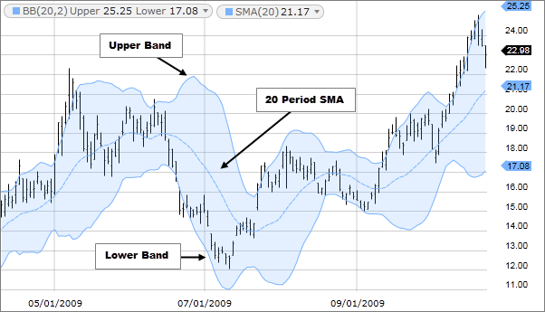
An example of the Bollinger Bands
Next part is coming 😀
More information to connect me telegram
@atanu021.
Thank you 😊